
Creative Direction, Team Leader
The UCSC Treehouse initiative is breaking ground in cancer research through shared genomic data. I took on Treehouse as a client of my Design Firm, where I led a team of designers, engineers alike to create a unique web experience for their diverse audience, in order to meat their needs of acquiring continued funding and volunteers.
Before I came on, Treehouse Childhood Cancer Initiative had no independent online presence. They were hidden as a side page deep in the UCSC Genomics Institute website, which we also redesigned and delivered.
my role
Besides conducting User Research and leading and defining the design direction, I oversaw a team of User Interface Design/Developers, full-stack engineer, created roadmaps, held sprints, and conducted stand-ups, every morning.
Some of what I delivered to the team included:
- Collaborate with Stakeholders to Define Goals
- Create Statements of Work
- Cost Estimatation
- User Research Insight Translation
- Competitive Market Research
- Creative Brief
- Personas
- Site Maps
- Digital Wireframing
- Roadmaps
- Visual Design Mock Ups
- Marketing Design
- Overseeing engineering
- Supporting engineering
- Design Mentoring
- Client education, for post hand-off
the problem
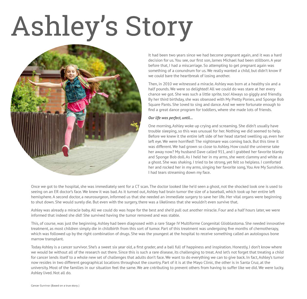
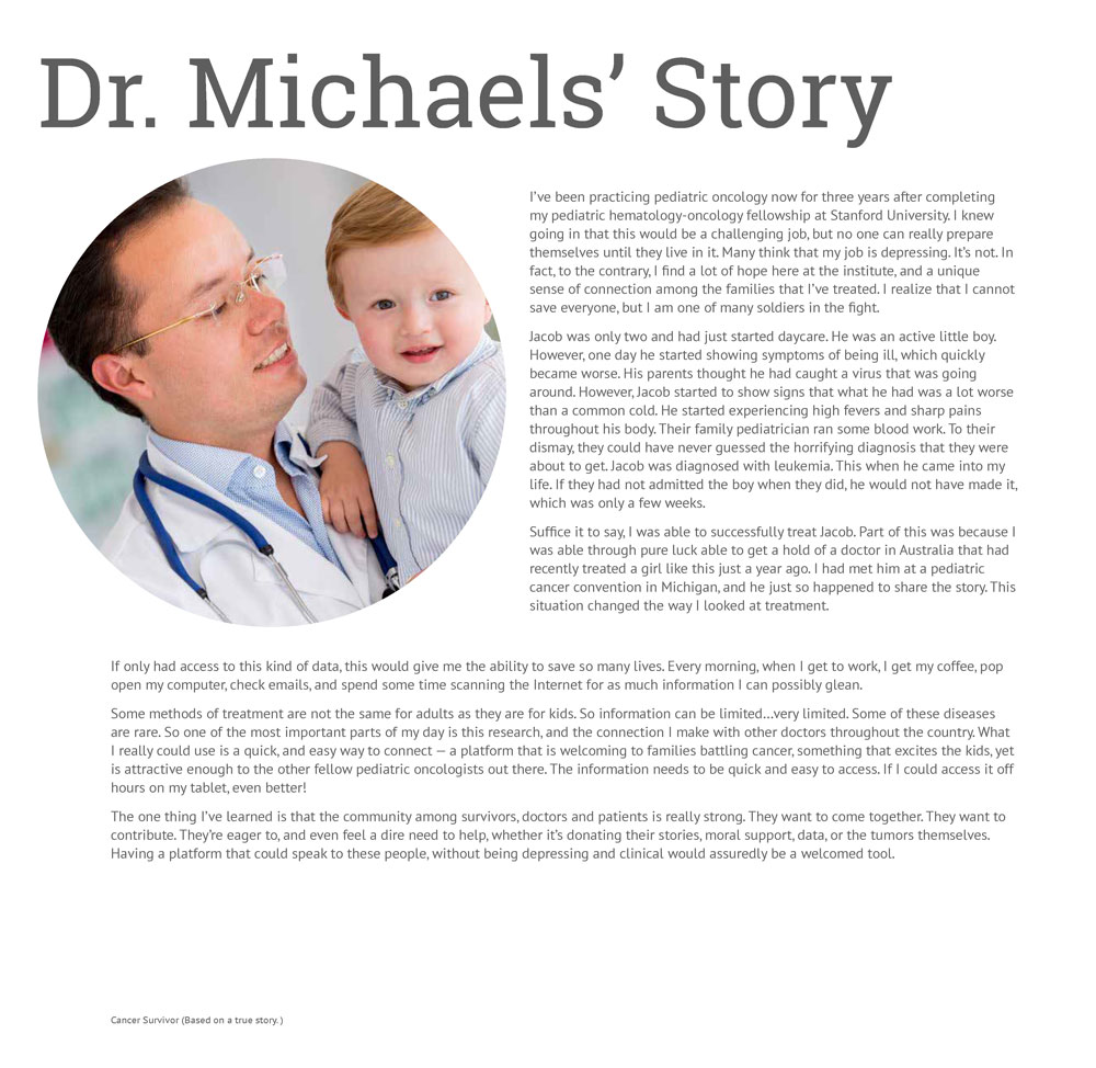
Children are a metaphorical and literal representation of new life, fun, fantasy and play. It is a cruel irony when a child is diagnosed with cancer. Just the same, children still tend to prefer to live in the world of fantasy. This poses a communication problem when discussing something as serious as a potentially fatal disease. We must express the gravity of the issue, without losing, or in many cases terrifying the audience.
Our challenge was to tell the Treehouse story in such a way that is inviting people to take action, represent these young victims of cancer, and keep a scientific voice.
We can’t make cancer fun, nor do we want to. So what do we do? We focus on what is positive, what is hopeful, and the childlike imagination, in order to communicate hope, and bring the adult world into believing in miracles, just like children do. Allow our audience to see through the children’s eyes.
the goal
It had to be clear that Treehouse reads as a pediatric cancer initiative. The goals of Treehouse were to involve more people to contribute and take part, either by donating data, or being angels in funding the project. In order to do there was a need to appeal to various types of people: children with cancer, parents of children with cancer, doctors, scientists and investors.
discovery
Empathy was an imperative part of getting to our solution.
Much like some of the other Genomic Institute initiatives at UCSC, community plays a strong part of its success.
And as we found, most people whom have experienced cancer, either themselves, as children, or as the parents of victims and survivors, they all share one common thread: They want to help. They want to come together. They want to give back.
In order to get a good idea of our audience, I conducted a great deal of qualitative research. This meant conducting interviews, joining forums, following social media profiles, reading articles. Along my way, I had witnessed so many inspiring stories, such a strong sense of community and love. Among these people were not just parents of kids with cancer, but also teens themselves, and even adults that had survived childhood cancer. I can't say enough about how much joy and belonging each person opened up to one another.
Much like some of the other Genomic Institute initiatives at UCSC, community plays a strong part of its success.
And as we found, most people whom have experienced cancer, either themselves, as children, or as the parents of victims and survivors, they all share one common thread: They want to help. They want to come together. They want to give back.
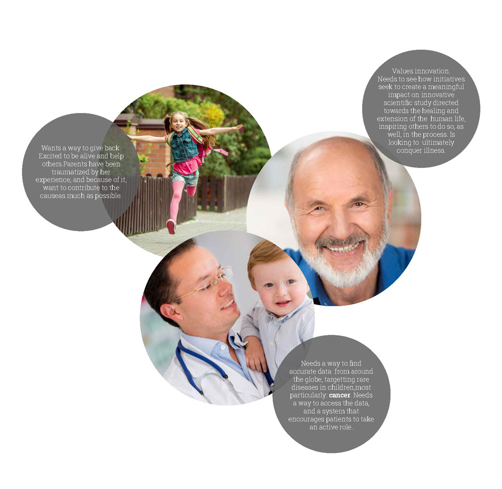
personas

empathy map
inspiration
The importance of defining the voice, affected both the visual direction, and influenced the content market strategy. It gave us the guidelines for how we were to tell the story, and create hierarchy in the architectural structure and interactions of the site itself.
design criteria vocabulary
Hope
Team Work
Science & Learning
Giving Back
Innovation
Have a Story to Tell
Dreamer
Miracles
moodboard

definition
The head of Marketing came together for work sessions to collaborate on categorizing the content needed. We worked together to sort all of the necessary parts, and make sure the business needs were met, as well as the audience needs.
from the design brief
"The User Experience for the Treehouse Children’s Cancer Initiative will be one that is fun, educational, and beckons the user to believe in miracles, and act. It will carry with it a childlike atmosphere, which will tell a story. Ideally it will use a language that speaks of contributing to a miracle. The navigation will be simple and organized, so that the users can find their way around easily, especially when it comes to taking action, such as donating data or funding the initiative. Information will be arranged logically.
Since topics like About, Vision and Team are synonymous with explaining who we are and what we do, they will all be contained in the Home page, as their own sections, in a continuous scrolling page, which will lend itself nicely to some creative scrolling techniques such as parallax, and animation, if and where appropriate.
The News page will be in a blog-like format, making it easy for the university to upload new articles, once the site is completed.The idea is to give the site a sense of magic meets science. With this in mind, visuals will be illustrative, and introspective, fun and mystical. The interactive objects may contain animation and parallax."
The goal architecturally speaking, was to keep navigation simple, and easily discoverable, since we had a few different audiences with different needs, and different ways to navigate."
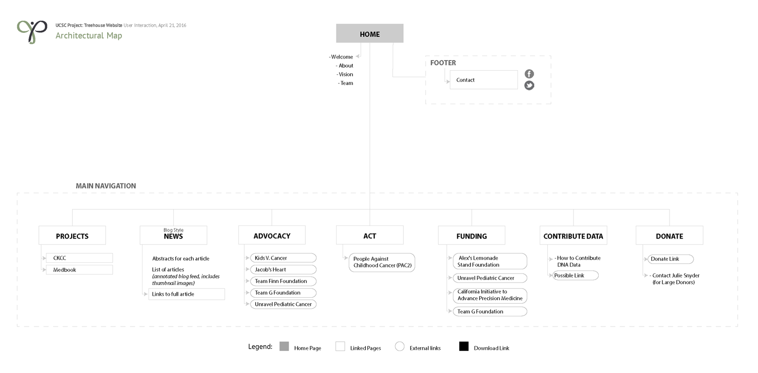
architectural structure
I created a sitemap, which was helpful in making sure that we were aligned with stakeholders on the content that was included on the site, prior to diving in and creating.
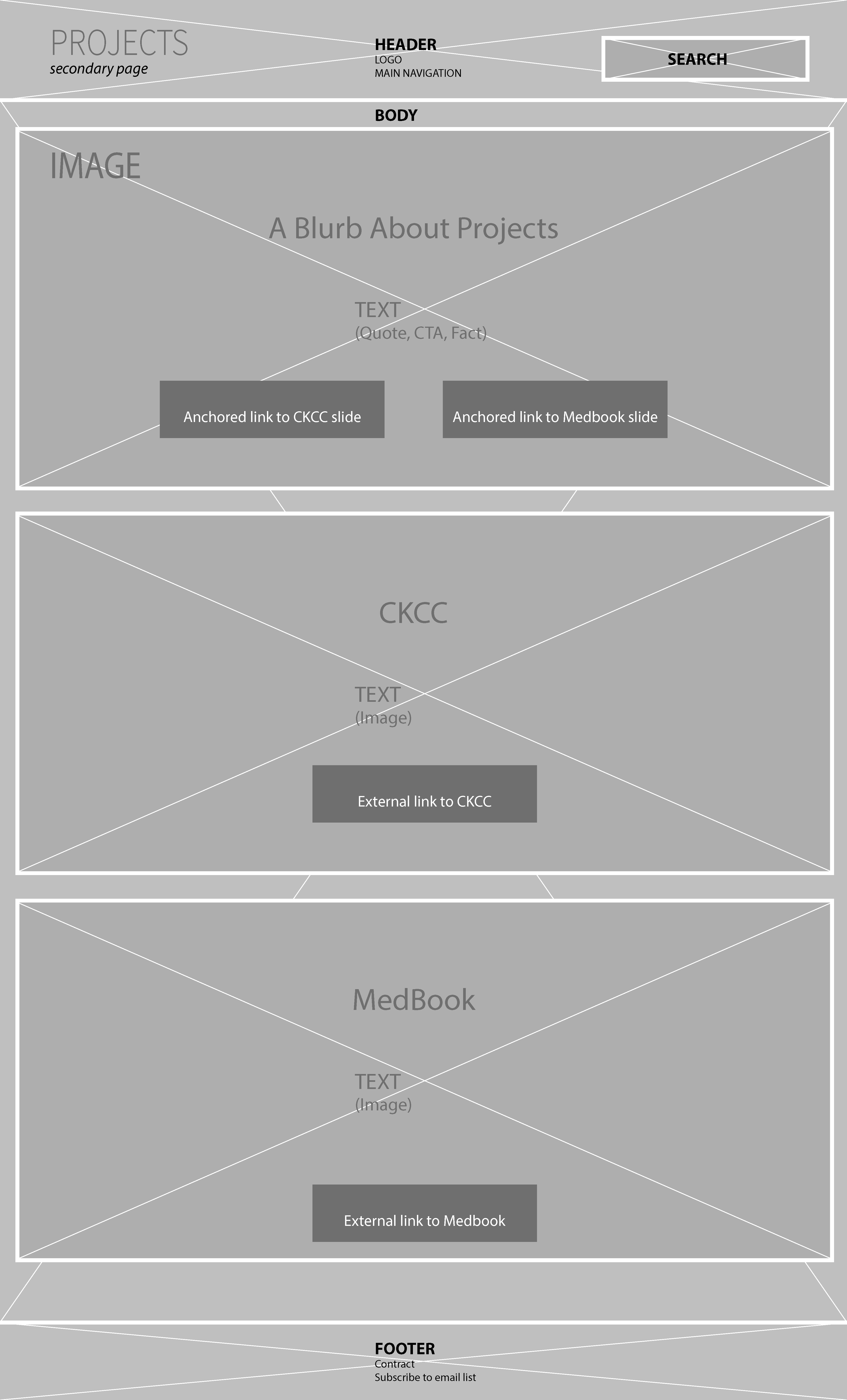
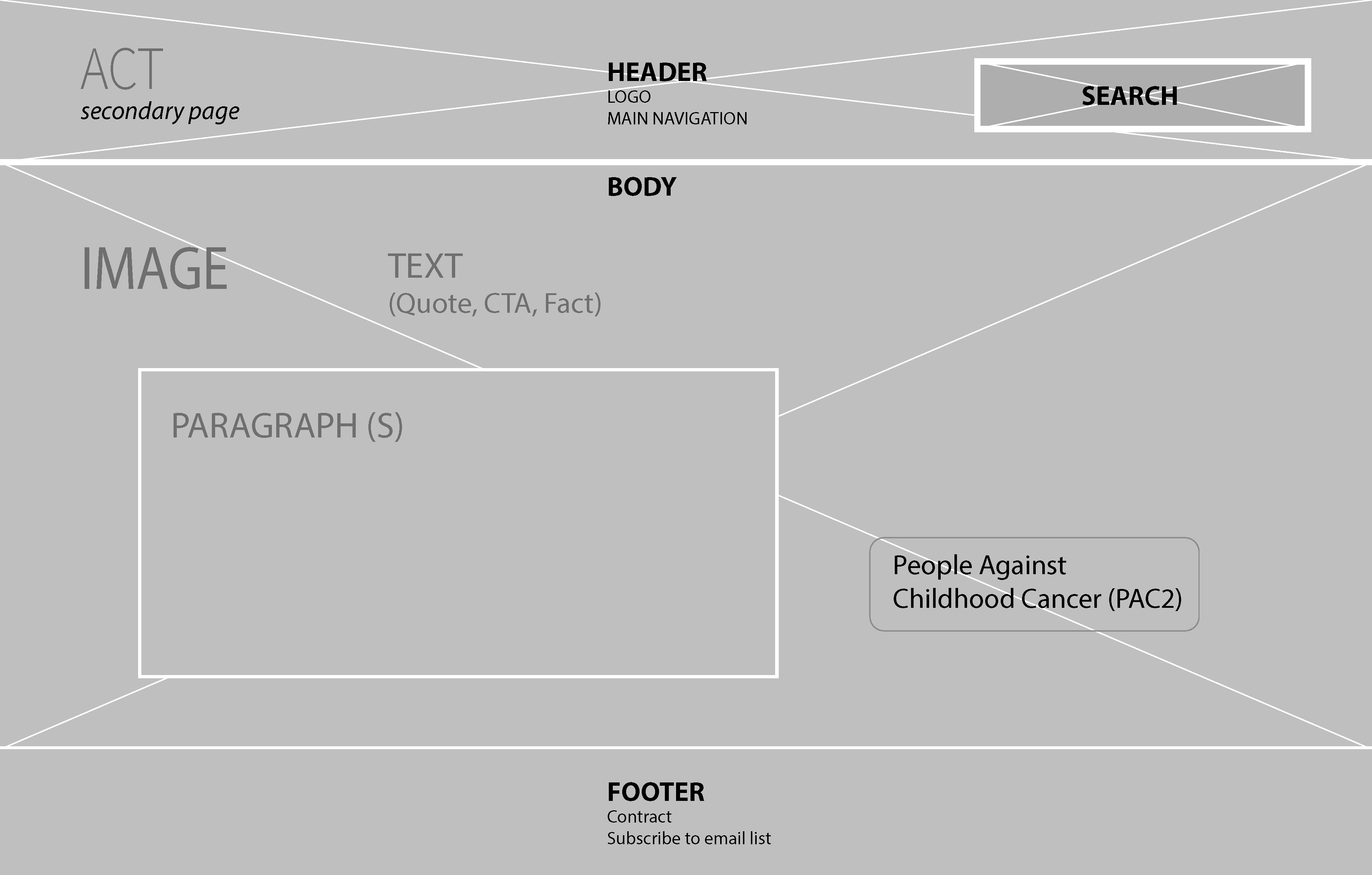
wireframes
The wireframes were created as an integral part of a design plan. However, they were used more internally to communicate to engineering and marketing, as well as define the structure of the pages.
Some of the wires:
visual direction
Our Mantra:
Teach the adults to believe in Miracles
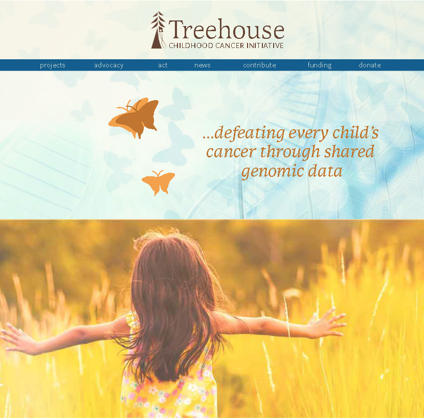
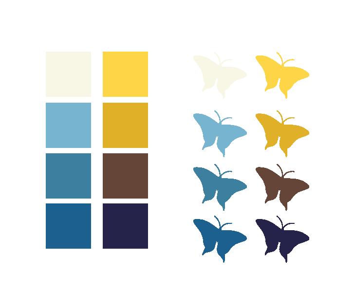
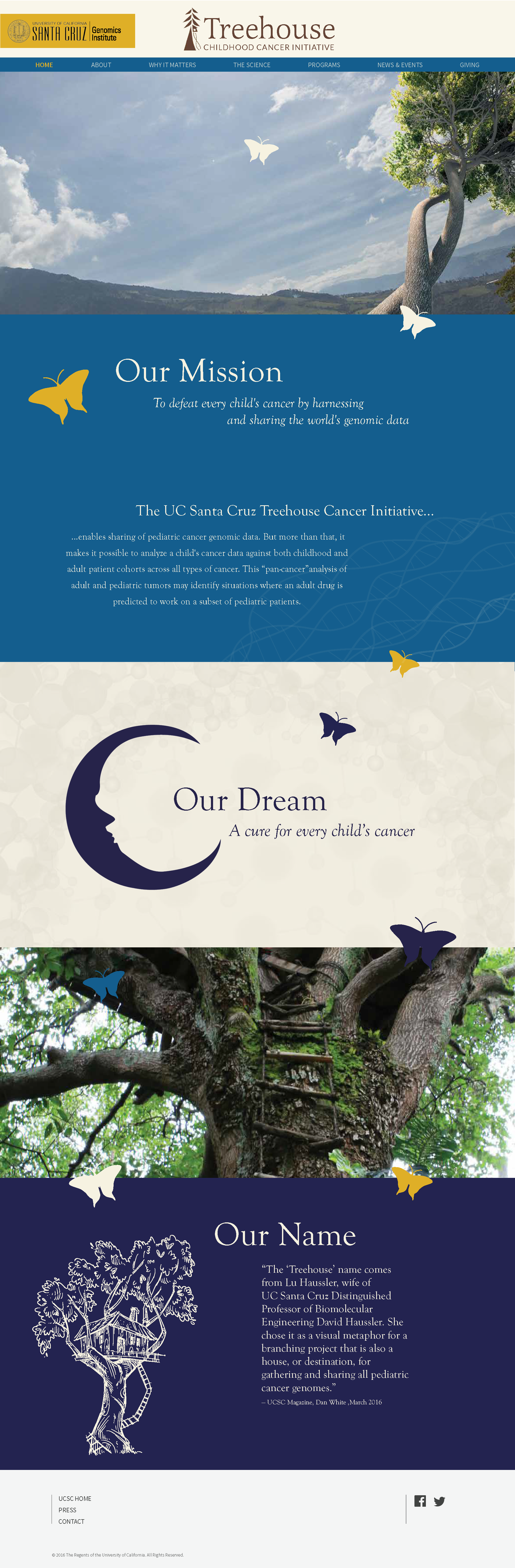
I chose the butterfly to accompany the user through the journey. Butterflies are a wonder, uplifting, magical, and precious – which imagination is made of.

I kept them simple, just a colorful silhouette, so that they would lend a pleasant design element, without distracting from the overall design.
visual design
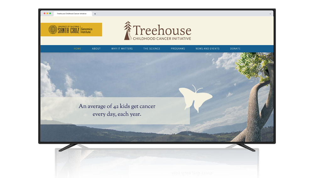
Original Home Page Hi Fidelity Mock-up
launch and reception
Even with the technical constraints of WordPress, our team delivered a custom-built solution that launched on time and exceeded expectations. The addition of layered animation brought the brand story to life, creating an immediate sense of delight for visitors. Post-launch, the site saw strong engagement and highly positive feedback from both the client and its community. To ensure sustainability, I developed tailored tutorial walk-throughs and led knowledge-transfer sessions with UCSC staff, equipping students and interns to manage content updates independently. This approach not only reduced long-term maintenance costs but also fostered ongoing ownership and growth within the organization.